Client
ABN AMRO Bank
Year
2011 - 2012
Role
User Experience design
Team
Jungle Minds / Capgemini
Link
abnamro.nl
About the project
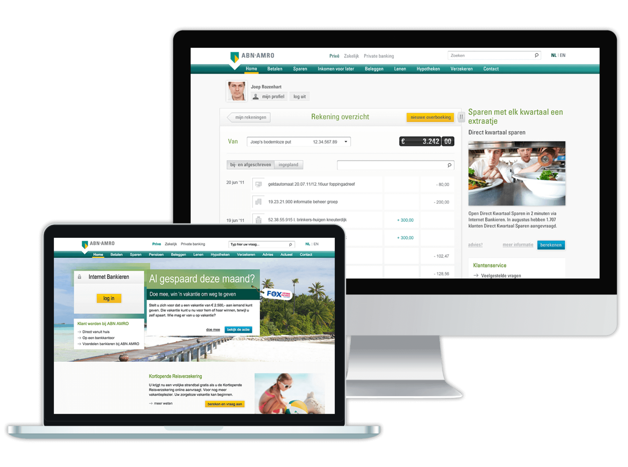
As more and more consumers wish to do their financial and banking business outside of office hours, there is an increasing demand for digital services in personal banking. Being of the three largest banks in the Netherlands, ABN AMRO stated their ambition to become market leader in online banking services. Their old online banking system being over 20 years old, one of the first (and largest) projects was to completely rethink, restructure and redesign every aspect of the daily interaction between customers and their personal bank accounts. Starting out with the concept of making online banking more tangible and visual, the project quickly became one of the largest i’ve ever been part of, with over 25 fully staffed scrum teams working simultaneously on all the different facets of the banking platform. In this project i was responsible for the user experience of one of key flows for everyday users: creating, verifying and approving bank transactions.
Challenge
With over 3,5 million customers it was very important to create the best possible flow and interaction. Especially for the parts that would be used on a daily basis, every little detail mattered and every extra click would quickly become irritating for users. The biggest challenge in the design of those features was to create the perfect balance between simplicity and ease of use on one end and additional functionality and complexity on the other. As with most complex, interactive products on the market, most users only use 20 percent of the offered functionality and never touch the remaining 80 percent. Preventing this so called ‘feature creeping’ would eventually turn out to be another large challenge.
Approach
With the customer interface of the banking platform becoming such an important aspect of online banking, the importance of working very closely with both stakeholders and developers was essential. Also, this project would be the first Agile project for the client, meaning that for many of the back-end developers it would be a completely new way of working. My role as UX designer in the team was mostly about communicating and especially translating between stakeholders, product owner and development. After the initial scoping of the project, the product owner and team decided to approach the ideation, design and development ‘flow-based’ instead of ‘feature based’. This gave everyone in the team and the stakeholders the chance to think about every feature request in terms of where in the flow it would be most relevant for the user. The first step would be to start out really small, covering only the basic flow.
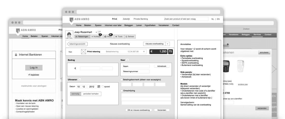
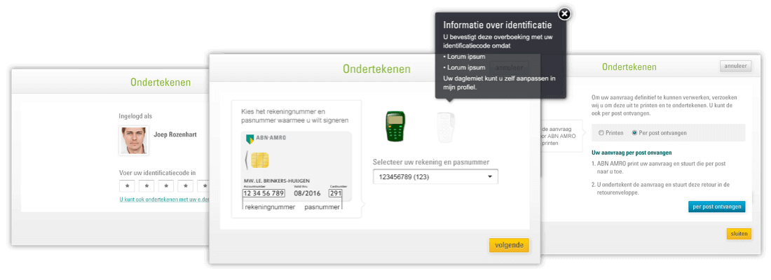
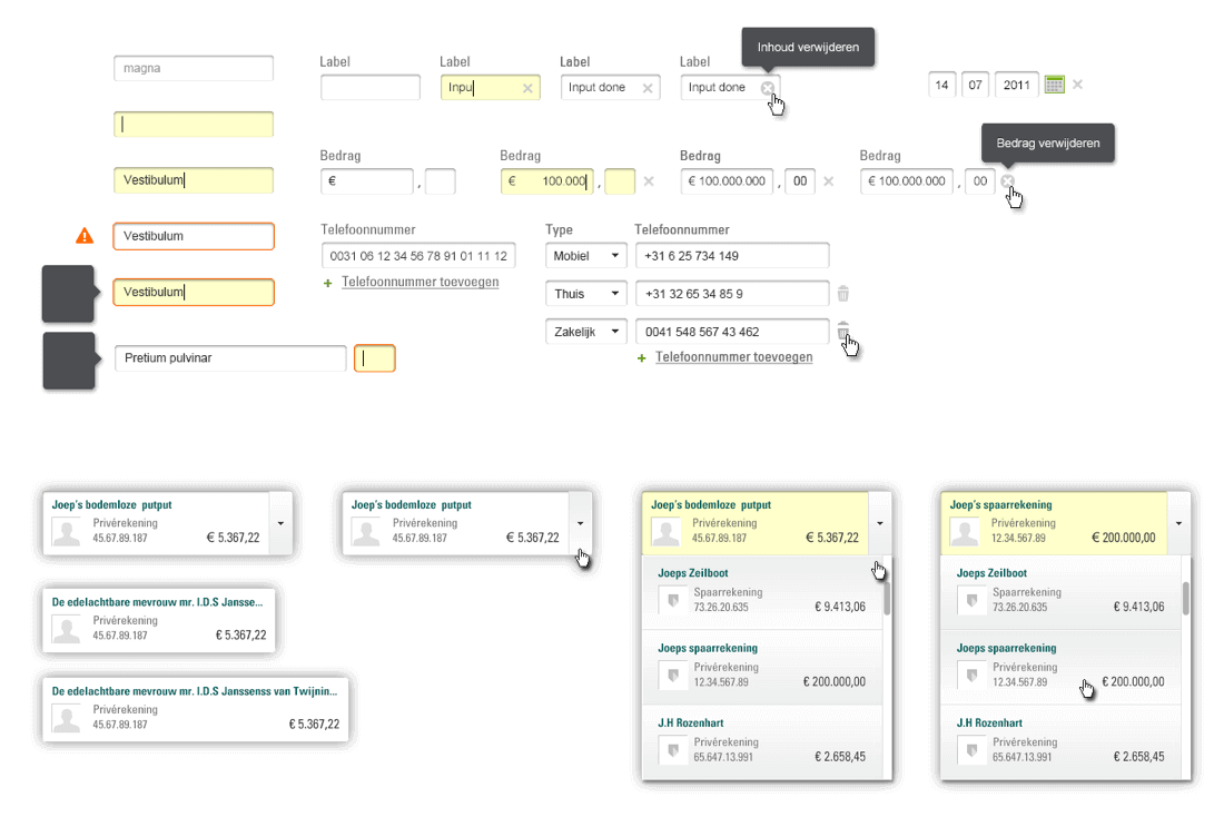
The next step was dealing with the different security levels. Because of the multiple login and signing methods, and each one with their own limitations, we needed to create an overview of all the possible scenario’s and variables. An additional challenge was that the singing flows needed to be a modular process, which could be called upon from nearly every possible screen or flow within the whole online banking platform. For this i created an clickable prototype which featured a dashboard. In this dashboard we could set different variables which in someway or other would affect the main user flow.
Action list
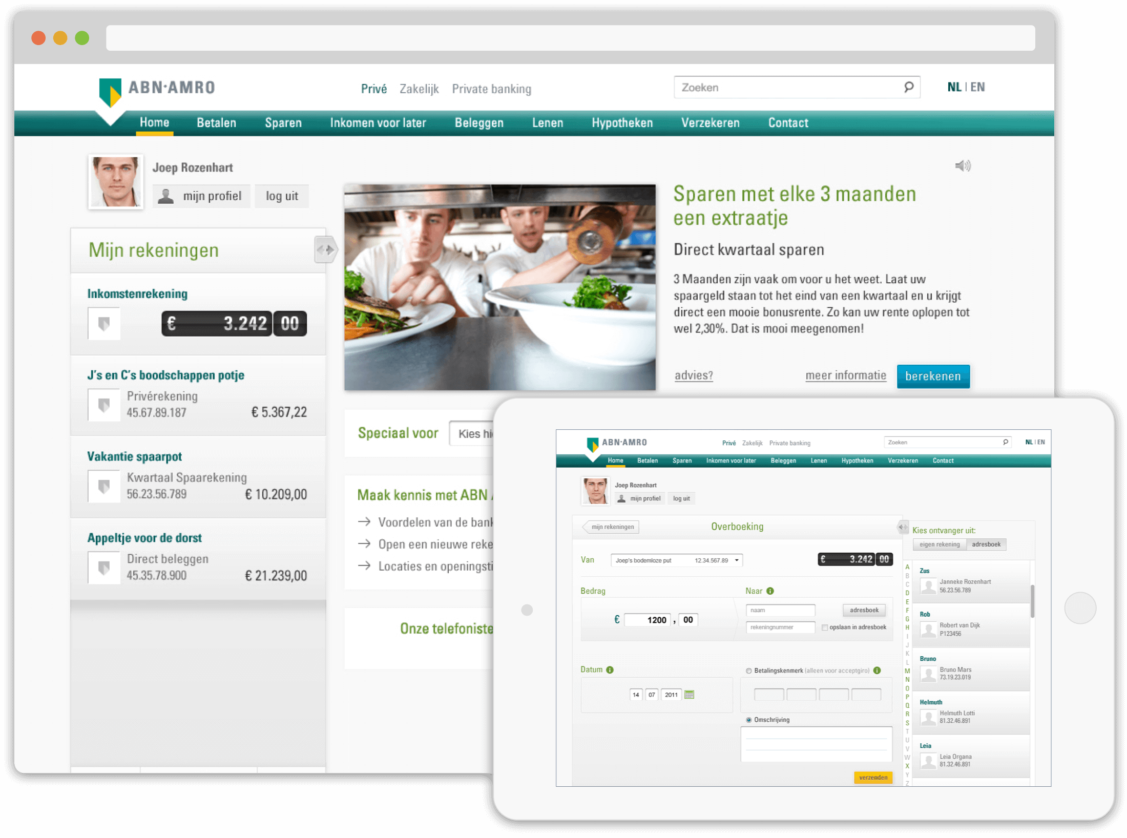
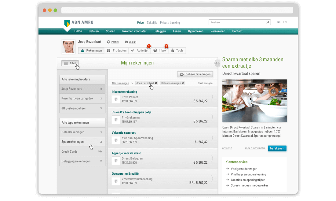
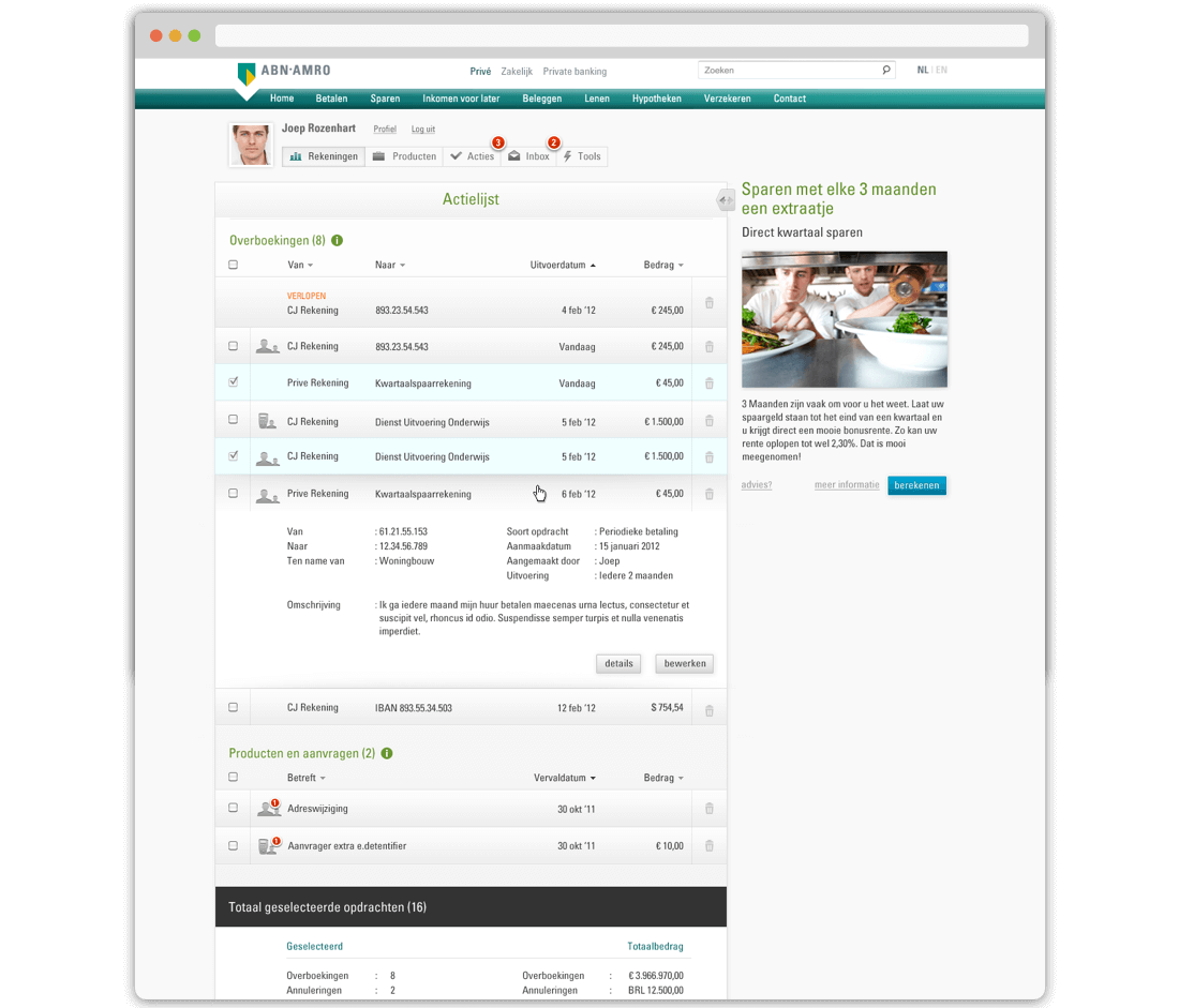
After the first couple of sprints, with most of the basic functionalities and security levels covered, it was time to scale the product. Up until that point we continuously had focused on creating, editing and sending a single transaction. Although this was a good way to achieve simplicity, in reality it happens quite often that users wish to make more than one transaction at a time and knowing that businesses would sometimes have hundreds of transactions at a time, we needed to create something where all of these transactions could be gathered and send simultaneously.
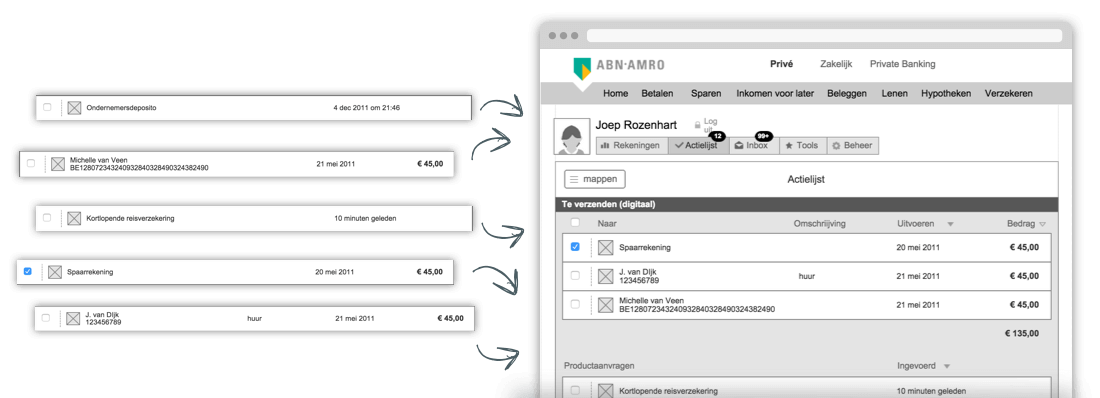
This proofed to be quite tricky due to the large variation in transaction types; they could be simple money transfers but also stock-orders, batch payments, foreign currencies, loans, etc. The presentation of all these types of transactions in one consistent view turned out to be one of the most challenging tasks. To solve this puzzle i talked a lot with all the different business owners, finding out which data was essential and which additional in order to minimize the clutter and information overload. After testing different variations, the solution in the end was to provide every type of transaction with an optional detail view in a dropdown, giving the users the opportunity to inspect a specific element closely without disrupting the main task.
Testing the product
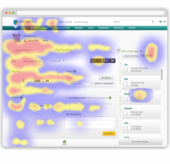
After every couple of sprints, it was time to test. Luckily the ABN AMRO had in-house usability-test lab we could use. Together with the research team i wrote out the scenarios which we wanted tested, created a clickable prototype in Axure and acted as observer while testing took place. After the initial test, i organized regular testing (5 in total during the project) after every couple of sprints when we had a sizable amount of new functionalities and features. Because of the importance of good UX in the platform, i also invited the developers from my team, as well as the stakeholders to the project, to regularly visit the tests to observe how the product was being used and interpreted by actual customers. This proved to be very valuable in creating a shared understanding of the product and this in turn made discussions about new functionalities and features a lot easier and more efficient.

UX Pattern library
Because of the large scale of the project and all of the different teams working on the product simultaneously, keeping the platform consistent quickly became the main topic of discussion between the designers of all the different teams. Because of the lack of documentation within the sprints, we came up with the solution of a pattern library. Having some time left, i started out by gathering all the components and patterns used so far by the different designers and started clustering, merging and deleting all of the different assets. After some initial reviews with the other designers, discussing which solution were best, i created one consistent pattern library within Axure and sharing it across all of the teams. This was a huge improvement in keeping all of the different flows as consistent as possible. During the remainder of the project i frequently updated the library, and after the project was done i turned it over to the in-house UX team who still use it today.
The Result
After working on the project for almost a year, the new banking platform went live in July 2012. In the first few weeks there where a lot of positive sounds from most customers, as well as the anticipated negative sounds from customers who’ve gotten quite used to the old system. The most important result was that this project not only delivered a very solid product, but also changed the way of working with the client: today nearly every project they do internally is done with an agile mind-set and the in-house online/UX department has more than doubled in size, still frequently updating the product with new features.