About the client
Reclamefolder is a Dutch company, founded in 2009 and aims to change the way mailbox and paper advertising works by digitalising the ad brochures ('folders' in Dutch) and making them available online. This gives retailers more flexibility in publishing and distributing their ads and also reduces the amount of paper waste in consumers households. Due to this win-win situation, their mobile app has, since launch, been downloaded over 3 million times and has over 800.000 active weekly users (which is a lot for the Dutch market).
Challenge
Despite their already massive user base, the company was experiencing issues with their revenue stream. Their business model was based on a pay-per-view contract they would enter with the retailer for publishing the ads. Although this model had worked in the past, more and more retailers were getting resistive to paying for views and started backing out. This meant that Reclamefolder would not publish their brochures which, in turn, created conflicts with their app-users who were missing brochures from their favourite shops and started complaining or even abandoning the app. The overall challenge was pretty clear: Reclamefolder needed a new direction in both their business model and mobile app strategy.
For Reclamefolder i was involved in the entire process and specifically responsible for organising and facilitating the design sprints, analysing the results and the translation into detailed wireframes and prototypes illustrating key concepts and flows.
Approach
After a initial discovery phase, it felt logical to explore the new direction for Reclamefolder by starting with their prime asset: their massive user base. If we could utilise the user interaction with the app and turn userdata into retailer insights, Reclamefolder could become a data-drive business rather than a pay-per-view publisher. Business-wise this seemed a very viable strategy, but would it also be a desirable direction for the users of the app?
“How might we gather valuable retail insights from our users without scaring them off?”
To kickstart the project and take a deep-dive into the challenge, i used the design sprint methodology by Google. The sprint team consisted of a mix of designers, researchers and strategists. The goal: to get a better understanding of what kind of data we would want to gather from the Reclamefolder app and how that would influence the app itself.
Design Sprint
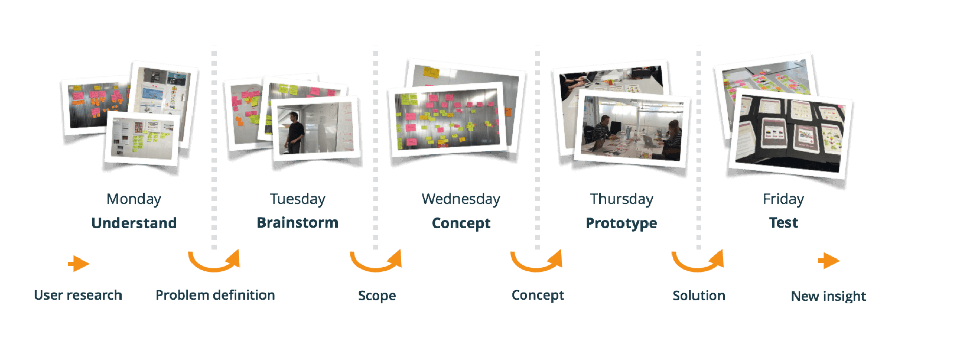
Understand
We started the sprint by analysing all of the user interviews we conducted in the preparation of the sprint. From these interviews we extracted three key learnings:
- Users we’re generally happy with current app, remarking a certain ‘homelike’ and ‘cozy’ experience
- Most users expected the app already gathering data about them. i.e. what kind of folders and offers they were looking at
- Most users used the app to kill time or to get inspired. Only a few users interviewed used the app to actually prepare their weekly shopping.
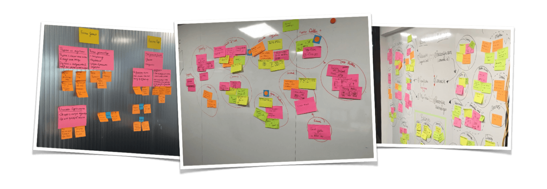
Diverging and Converging
With these learnings in mind, we started discussing and exploring entry points or ‘hooks’ which would be beneficial to the user but also would generate valuable data and insights to the retailer. We felt that the biggest proof of value of Reclamefolder to retailers would be if we could close the gap between passive browsing a folder and the actual moment of purchase. After selecting the most promising ideas, we merged them into three different user scenario’s we wanted to explore further, each scenario focusing on a different use case: ranging from passive browsing through folders, actively looking for the best deal and the actual moment of purchase.
Prototyping and testing
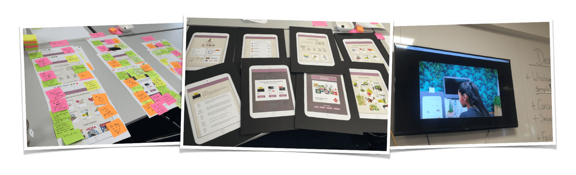
The goal of the design sprint was not only to deep-dive and brainstorm about potential solutions, but also about immediately prototyping and testing our ideas with users. We invited six users of the current app to discuss our new ideas with. To make those ideas more tangible i chose to create paper prototypes. I felt that paper prototyping would suit our needs better because it was more abstract and that way the respondents would focus more on the concept itself, rather than giving feedback on usability issues or discussing aesthetics.
Learnings
The testing itself provided very interesting insights to further develop our ideas, but also gave a clear sense about which direction not to take. For instance the idea of immediately ‘buying’ a product through the Reclamefolder app got unanimously rejected, because users strongly felt pushed to buy and the app would loose it’s neutral character. Another interesting realisation during the user testing was that in all of the scenario’s and prototypes the focus was on individual products, rather than folders or product catalogues. This was not something deliberate, since the current Reclamefolder app would only publish folders as a whole, not individual products inside the folders, but somehow felt so logically for both our ideas and also for the users during the testing.
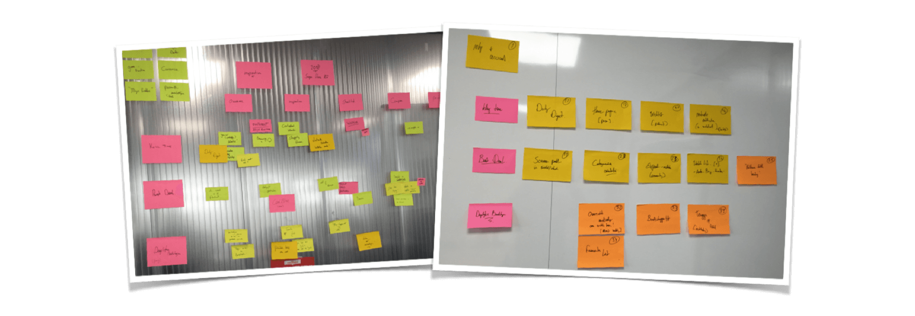
Building the Roadmap
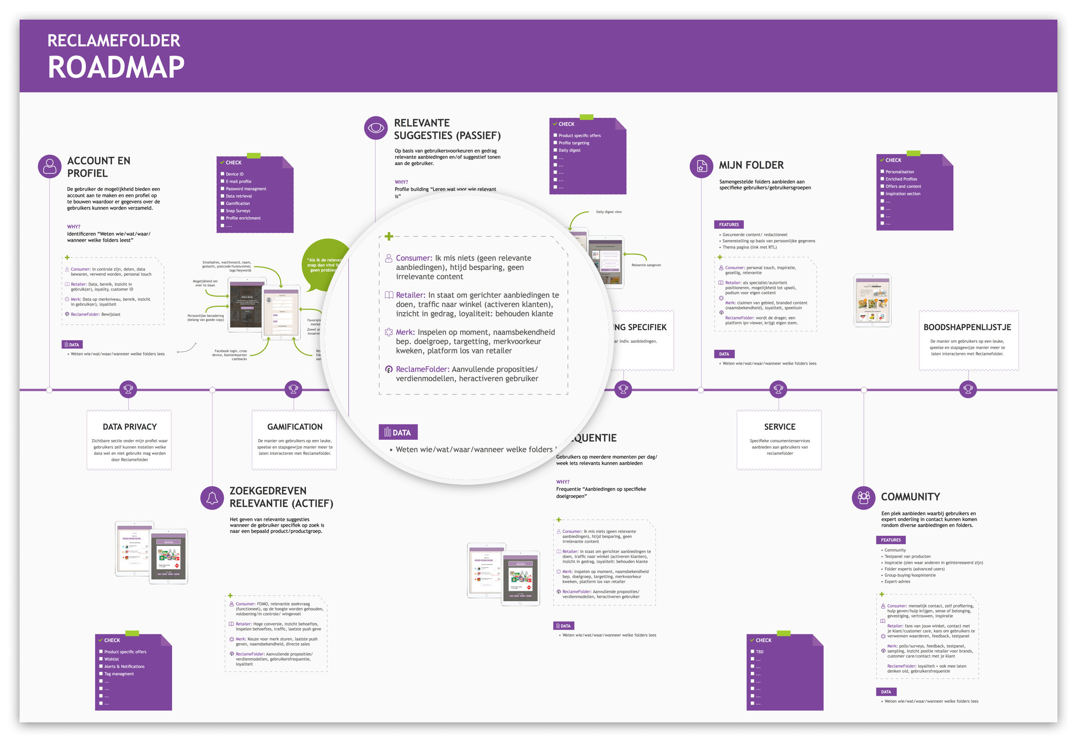
After the design sprint, i started to map out the features and ideas we had prototyped and tested. The first step was to start clustering features into themes and documenting all the epics and milestones that we needed to achieve for each theme. This would ensure that all of ideas we had gathered and tested were part of a bigger context and to avoid ‘feature-picking’. By mapping out the ideas i also discovered that for a lot of potential data gathering points, the focus on individual products would be very beneficial as it made the data so much more specific and therefore potentially more valuable to retailers.
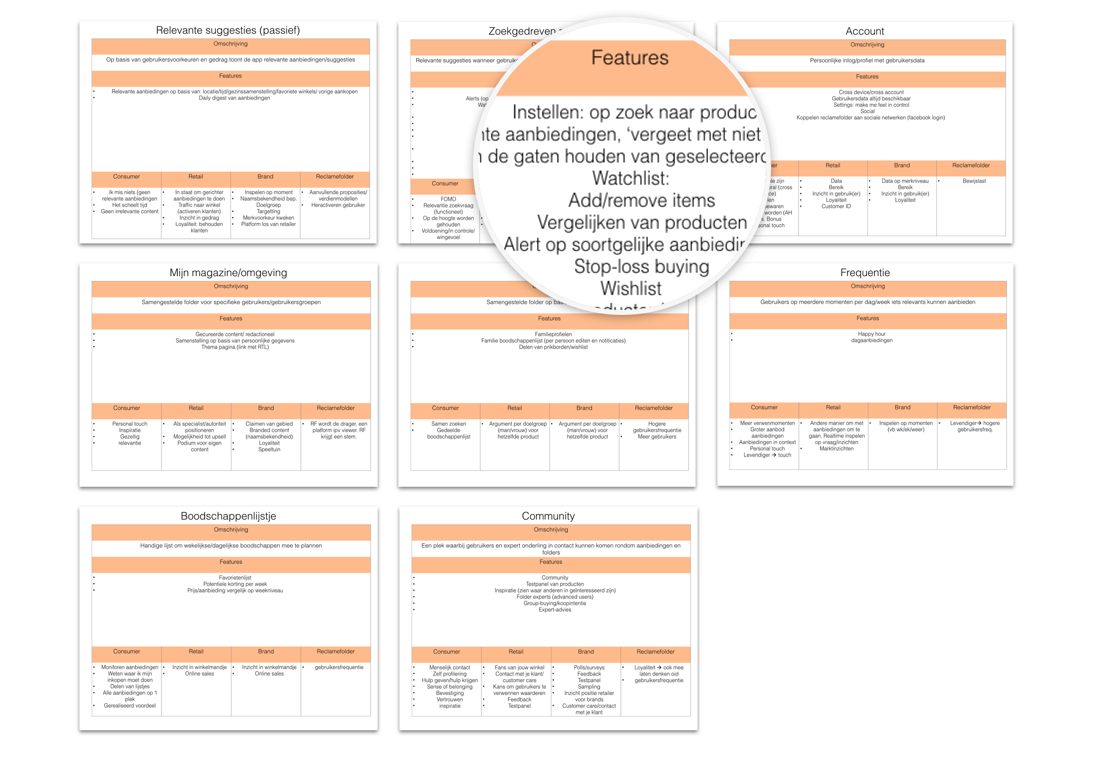
After discussing the themes with stakeholders in the project, we made a prioritisation based on three factors: User desirability, business value and technical feasibility. This resulted in the creation of the Reclamefolder Roadmap. To get both stakeholders and the development of Reclamefolder on board, we designed the roadmap in the form of a poster that could be hanged on the wall in their office and trying to be as transparant as possible about all the things that were coming up. The first major epic on the roadmap : getting the current app in proper shape by creating a solid foundation.
Design requirements
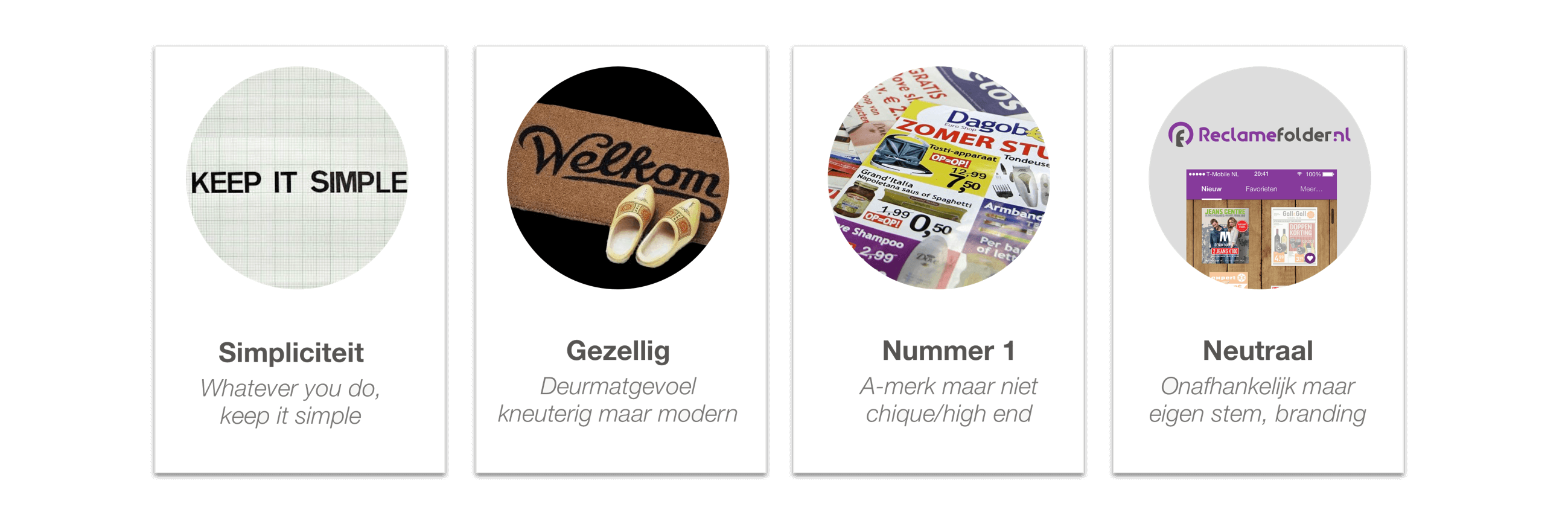
From the initial interviews and the user testing during the design sprint we also gained a lot insights into what users found valuable and desirable in Reclamefolder. To make sure that we would keep those insights alive during the rest of the project, we defined ‘Design Principles’: short, written statements about the experience we (want to) offer the the users of the app.
Setting the direction
With the roadmap in place, we took a top-down approach to define the overall structure for the design. We deliberately chose to evolve the current app, as opposed to completely redesigning it from scratch. The main reason was to not scare off users by changing everything. With this in mind it started to become clear that we needed to focus part of our design on improving the navigational structure to account for all of the new features coming up.
Navigational structure
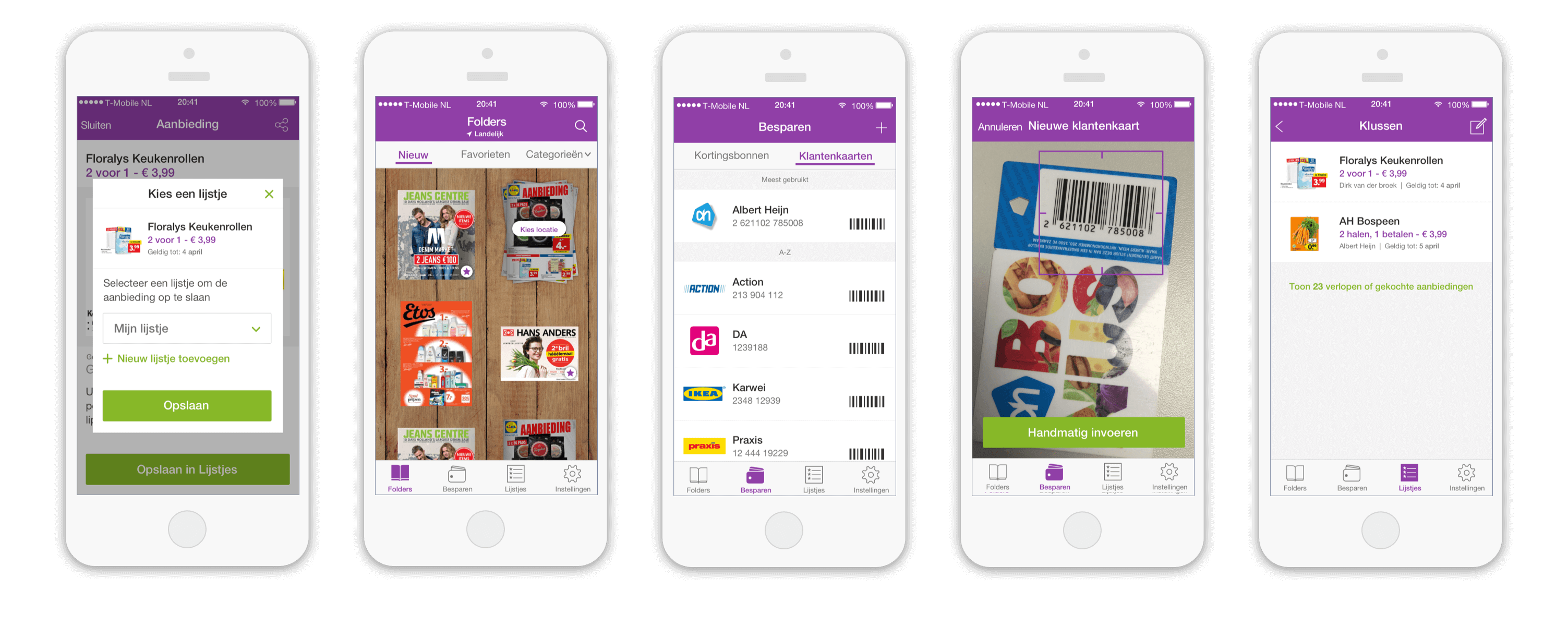
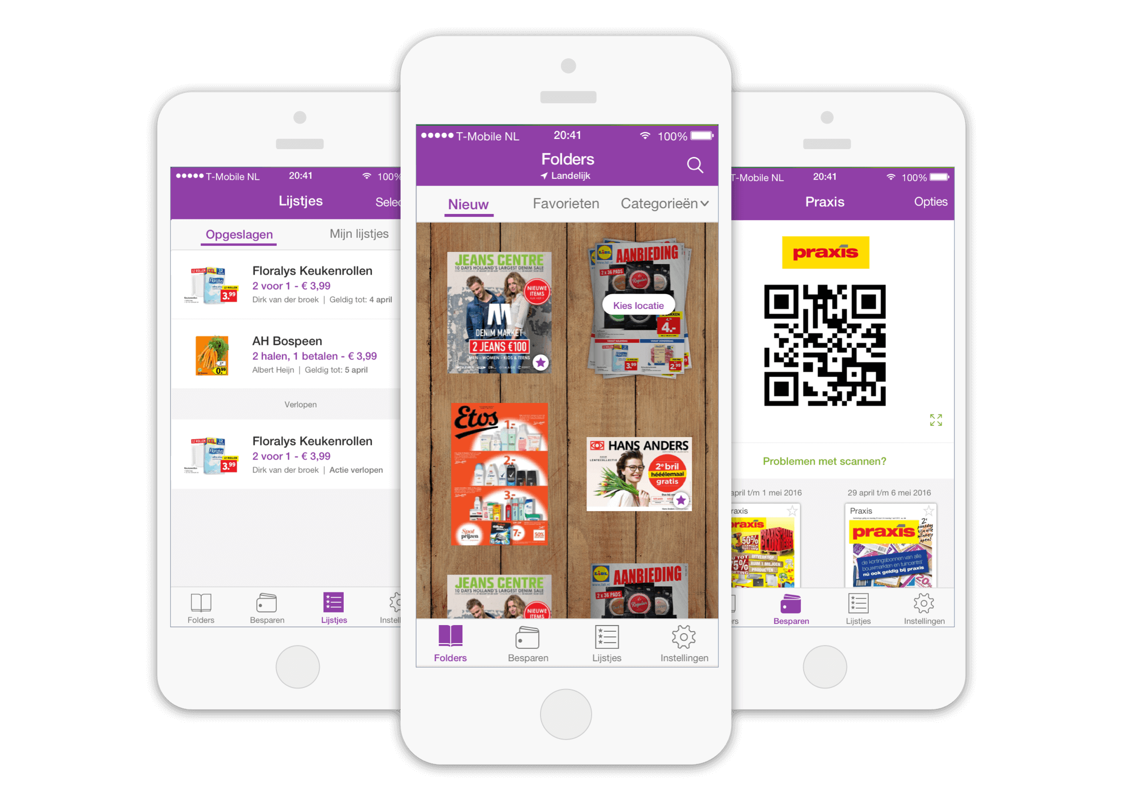
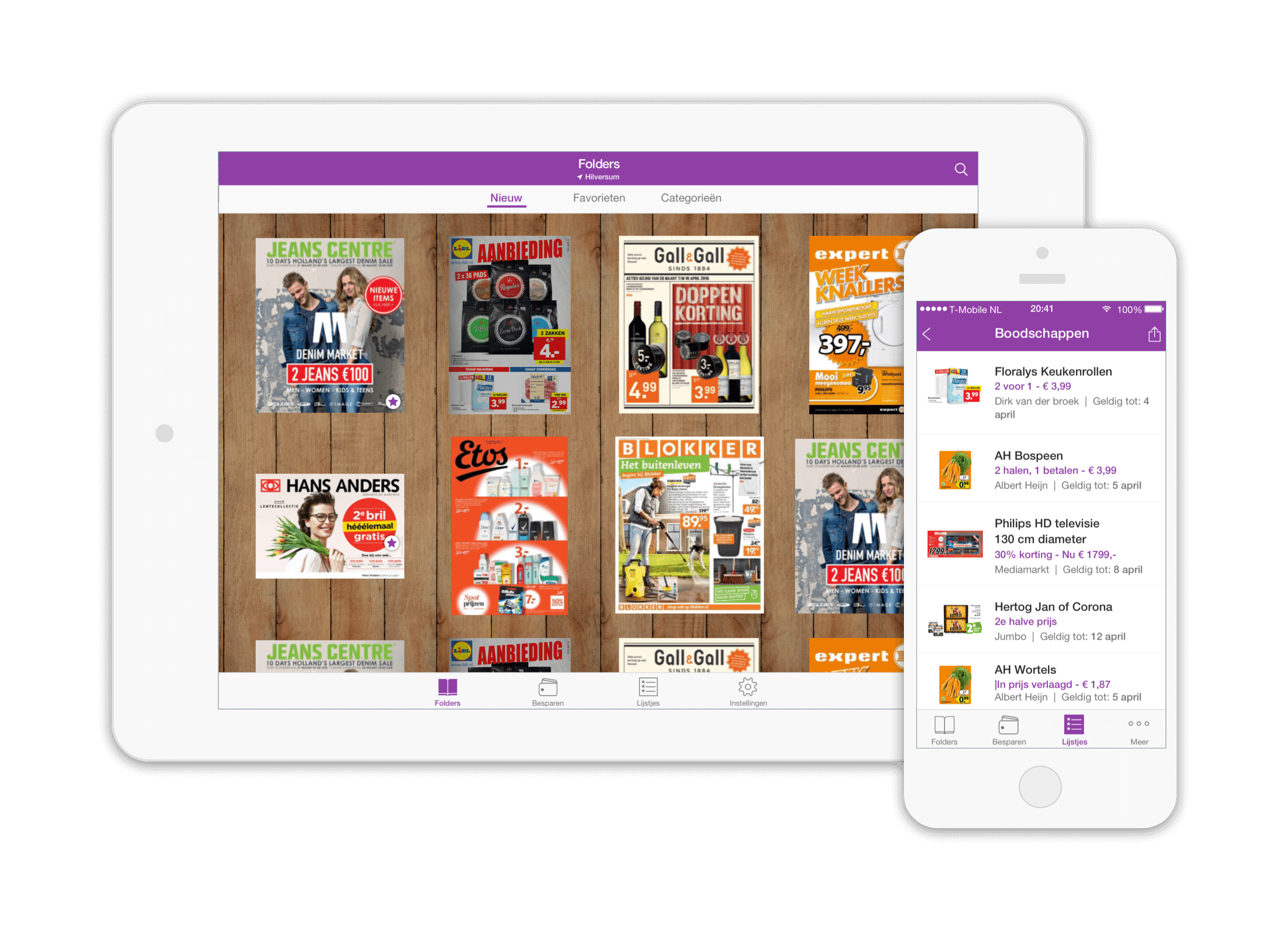
In the existing app, the main focus was on the folder catalogue. Although there was a side navigation panel in the app, it was rarely used. Also the huge amount of items already in the navigation panel made it necessary to restructure the way users would navigate through the folders and the rest of the app. I started to map out all of the current navigation items and combine them with the features we knew we wanted to add in the near future. In the mapping i made a very clear distinction between pull and push items. Pull items being the prime reasons for people to use the app (the folders) and push being features which we really wanted people to start using and exploring in order sustain and improve revenue.
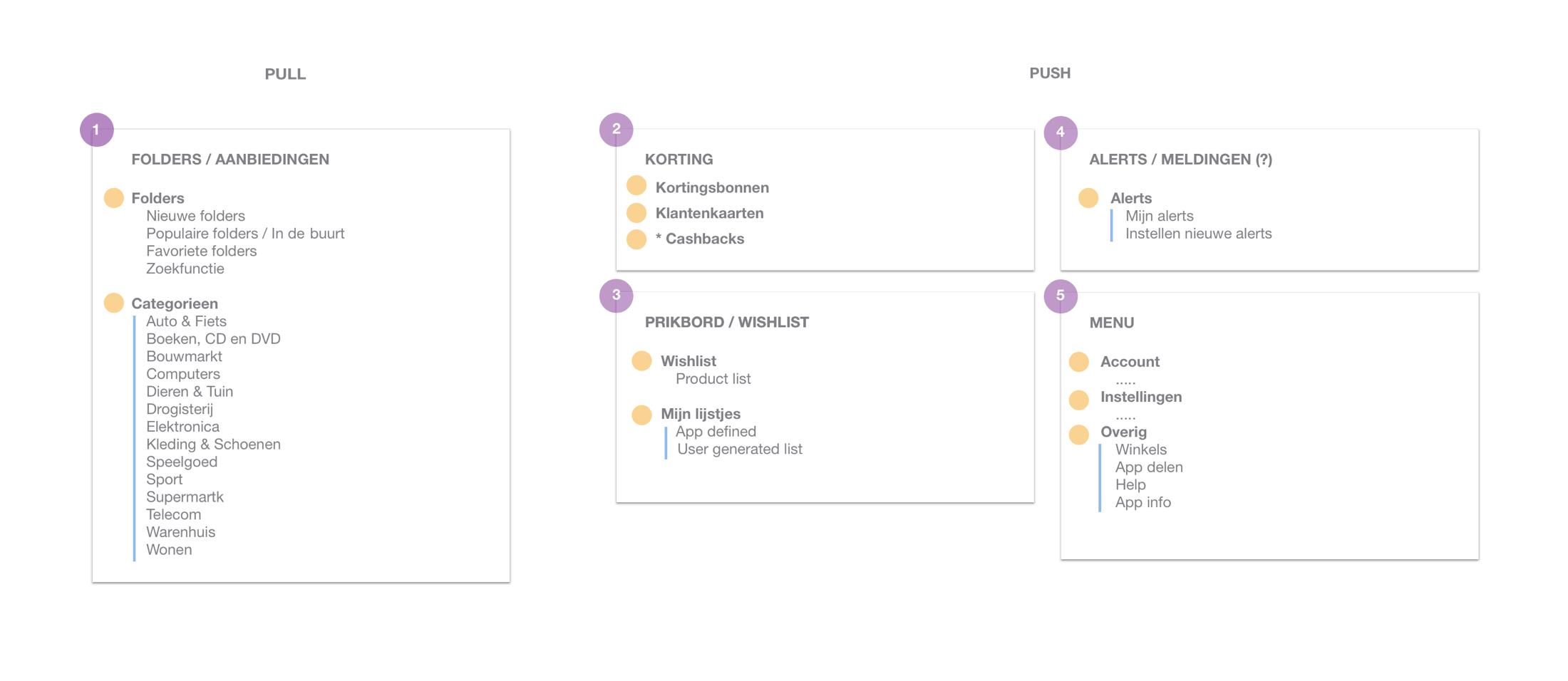
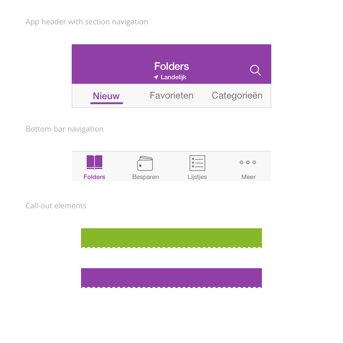
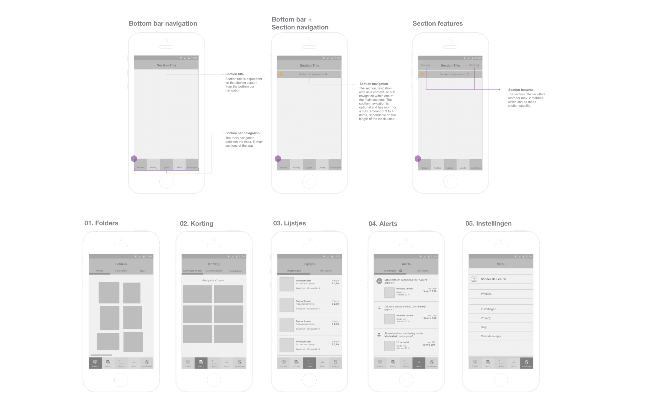
With all the current and new features mapped out, i started shuffling and reordering features. From the mapping it was clear that the app needed a clearer hierarchy between main sections and underlying features. To make sure that the besides the ‘pull’ section of the app (the folders), also the other sections (push) would be featured more prominently i chose to implement a always present bottom bar navigation, consisting of max 5. sections. This meant that every feature had to be positioned in one of these 5 sections of the app. In the sections itself i included both the possibility of section navigation as well as the highlighting of section specific features in the top-bar. This structure would accommodate for all of the current features as well as all of the known features on the roadmap.
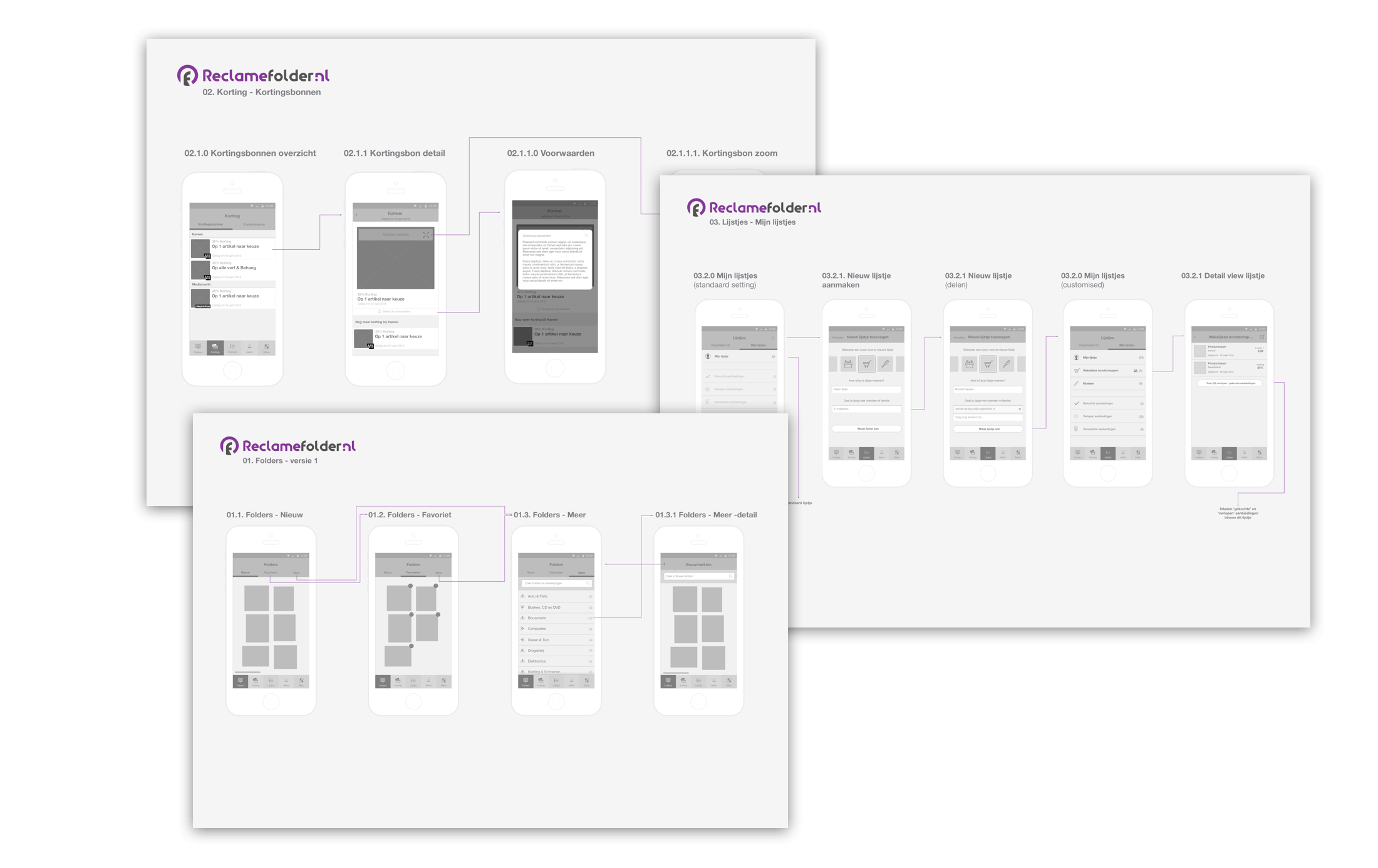
Detailed design
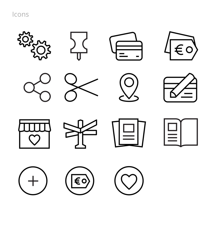
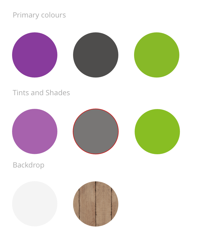
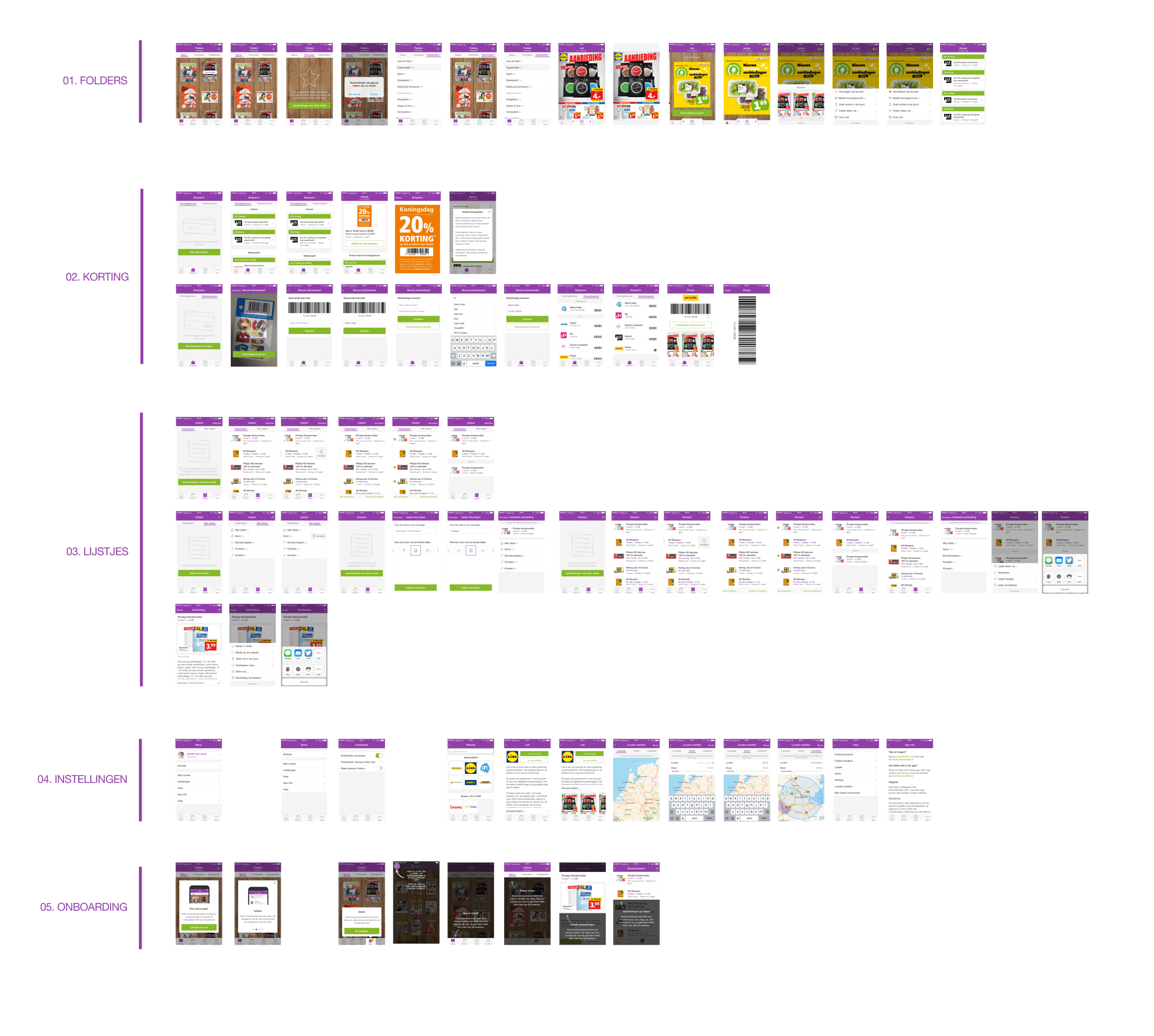
With the two main focus points of the redesign covered and approved, we started the detailed design of the new app. By changing the navigational structure of the app we needed to reposition every functionality of the current app in the new structure. This basically meant: redesigning every screen in the app. Because of the large amount of design work involved, i teamed up with two visual designers, one focusing on the tablet-app, the other on the mobile app. This allowed me to take a lead role, supervising progress and providing the team with wireframes, mock-ups and prototypes focusing on the overall flow and experience we envisioned.
The Result
Although the first release of the new Reclamefolder App only contained a small portion of the whole roadmap we had envisioned, it was definitely a step in the right the direction. The restructuring of the app and navigation provided users with a much clearer sense of what the app contained and the product-specific folders turned out to be a real winner. However, the real result of this project should be the change in revenue and business model for Reclamefolder. This is still an ongoing process within Reclamefolder, so those results are still pending. To be continued.